A Long Scarf ’round My Neck

Christmas Day: Before driving south some 70 miles to join family for dinner and an exchange of presents, I stopped at a convenience store to pick up a gift for a friend who has spent the entire month and will likely spend another in a rehabilitation center.

No, no addiction, but Parkinson’s Disease at a stage where he can do little more than read between meals that are served on his bed-tray or in the dining room at the end of the hall where a wheelchair with someone to push it will take him.

And read he does, always asking for the New York Times and the Wall Street Journal, a dual habit he has sustained for as long as I’ve known him going back to the Reagan years.

WSJ does not run on holidays, so I settled for the NYT only to be startled by the large over-the front-page-fold photo. Did the Gray Lady really put a painting of the three wise men on its cover? There was no headline above to give it away. My glasses, hurriedly applied, showed that I was looking at three donkeys, not camels, and the caption described people fleeing the war in Sudan, seeking refuge in Chad.

Still, the choice of image for December 25 could not be mere coincidence. Or am I just haunted by an uncanny thread in what might seem like a seasonal scarf around my own neck? Began three weeks ago when I prepared a Christmas column for the Daily News, a feel-good story about a package delivered to the wrong address due to a wrong turn called by Siri. As a spoof of the carol, I used “App of Wonder, App of Night” as the headline.

Barely two weeks ago I joined a No Kings rally of about one hundred brave-the-cold souls on a small town green where they usually have a drum circle. Just two drummers showed up, but that was enough. Improvising to their beat, I played all the standard Christmas carols I knew except for one I just could not find, and not for lack of trying: “We Three Kings.” That kind of irony is a blog that writes itself, though the headline was its best joke: “The We Three No Kings Band.”

While I was writing that blog, a friend of Middle Eastern descent posted an editorial cartoon:

The image arrested me as emphatically as that wall halts the kings. If we were to be honest about Christmas in America, 2025, it would be available as a greeting card, and I’d have sent it. Instead, it prompted a column headlined “Merry Exclusivity!” which has yet to hit print–likely next week, after which it will become a blog, available to all.

As always, I was last-minute getting cards to send out. For at least forty years, I always picked out large cards with images of the Archangel Gabriel and his trumpet or, if unavailable, of any wind-musicians or wind-instruments. The reason for large cards is to stuff them with a newspaper column or blog or two or three I’ve written over the past 12 months I think the recipient will like.

By the time I arrived at Jabberwocky Bookshop, no Gabriels, no flutes, no piccolos, no group of carolers, no drummer boy, no brass, no chamber orchestras, no angels with harps were on the card racks to be had. But I spotted a card with the three kings which was perfect for the enclosure I had in mind, the “No Kings” blog. You’ve heard the saying, “Sometimes the jokes just write themselves”? In this case, it was the card itself.

All that came to mind in the convenience store in the brief time it took to buy that newspaper. When I handed it to my friend in the rehab center, I said nothing of it, though I awaited his reaction. At first glance, he gave a start, but right away focused on the caption. His look told me that he noticed what I had noticed.

You’ve heard the saying, “A picture is worth a thousand words”? In this case, it was worth a thousand to appear accommodating us with what we celebrate this day, and then a second thousand to remind us of what we actually have this day.

A Christmas card-turned-reality check. If you happen to have a copy of the Christmas Day NYT, hold onto it. You’ve heard the expression, “hiding in plain sight”? Unannounced messages in large publications tend to become collector’s items–especially when placed over the fold of a front page.

On screen, this is much brighter and clearer than in print. Try to imagine a darker look at a distance of three or four feet to approximate what I thought I saw.
The first ever screenshot I have done knowingly. According to the icons on my screen, I did one of Sinclair Lewis and Dorothy Thompson. That icon has been there for at least three years. I recall finding the photo and posting it, but I have no recollection at all of noticing the word “screenshot” while I did. Is it possible to do without knowing it?

And on the day before Christmas when I saw no newspaper:

Christmas eve, I awake at 11:00, finish breakfast at 1:00, and put off all last minute errands until Friday or even Monday. Snowflakes the size of silver dollars starting to pile here on the island. Always piles more on the mainland, so why cross the bridge? Why test Stick-It’s tires on my steep driveway on my return? There’s bound to be a gas station open between here and Boston tomorrow when I trek to the South Shore for a couple days. Nine IPAs are enough in my fridge till Saturday. And who needs cash when you have a credit card? Or those rosemary-sea salt rolls from the Italian bakery when you’re making pancakes, that great excuse to have maple syrup, for breakfast and will be having holiday feasts away from home?

I say “Merry Christmas” when I know someone shares my general background, and “Happy Holidays” when I do not, but in both cases what I really mean is “Feed Me!”

Bon Appetit to all! And to all, a good bite!

-752-

By Himself But Not Alone

My immediate reaction to local artist Richard Jones’ latest painting echoed that of seeing Norman Rockwell’s 1965 Murder in Mississippi for the first time.

Americans grow up with Rockwell’s work even if they never hear his name. His wholesome, reassuring portraits of American life are everywhere:

Saying Grace, Freedom from Want, The Runaway, Fishing Trip, and others we see to this day on placemats, greeting cards, advertisements.

Jones is just as Dickensian. Other local artists tend more toward landscapes and rural scenes, such as Alan Bull’s rustic driveways with rusty pick-up trucks. Comparable to the Hudson River School, they might be called the Salt Marsh School.

Though he also does many portraits of the marsh and other landscapes, Jones is known for his downtown scenes, no doubt why his work is so frequently seen in State and Pleasant St. shops, and therefore, known to Newburyporters.

He also has the advantage of serving as city clerk for 18 years in an office keeping him downtown long enough to paint it from memory if he had to.

By capturing it in every season, day and night, rain or shine or snow, with people singing or shopping, walking and talking, Jones is the Norman Rockwell of Newburyport.

But the gallery of both artists is more than most everyone thought.  I cannot not be the only white Boomer who saw Murder in Mississippi for the first time shortly after an unarmed African-American man was killed under the knee of a Minneapolis cop in 2020.

After sixty years of associating Rockwell entirely with heart-warming, Leave-It-to-Beaver Americana, it came as a shock.

Now we have Jones’ By Myself but Not Alone. A depiction of Newburyport High School’s graduation in 1941.

I’d heard of that incident, so the subject was no surprise. Former Essex County Sheriff Frank Cousins told the story about a four years ago at a Martin Luther King Day commemoration.

Cousins’ father graduated with that class.  However, the mayor’s daughter would not walk with a person of color. She nagged dad, dad pressured the principal, and, as a compromise, Cousins Sr. was relegated to the back of the line.

I’m no art critic, and the painting is so rich in detail, that I’ll leave full descriptions to others—including to Jones himself who describes on social media the details and their distinct purposes.

As for the impact of the image?  Riveting.  In its force, its thoroughness, its humanity.

Followed by surprise—not at the subject, but by who painted it.  All of which recalls any Norman Rockwell fan’s first sight of Murder in Mississippi.

Granted, a portrait of a high school graduation with most of the people in it cheering and applauding, conveys none of the menace of one of murder in which the murderers are not in the frame but cast as shadows on the ground.

Jones’ By Myself is more comparable to two other Rockwell paintings: Moving In (1967) showing integration of a white neighborhood, and The Trouble We All Live With (1964) which was turned into a meme last year with Kamala Harris as the shadow of Ruby Bridges.

In fact, it’s easy to imagine Frank Cousins Sr. as Jones’ adaptation of Rockwell’s Bridges. Notice, for instance, the posture.

However, Rockwell depicted the South where Jim Crow was still the law of the land; Jones portrays a city where we like to believe we have always, unanimously been on the side of William Lloyd Garrison.

Rockwell held up a mirror to America in real time. Jones gives us a window into a past that is now a divisive issue in the present.

Here in Newburyport, as is true across the country, the MAGA movement is working to keep “uncomfortable” (for white people) history out of American schools. 

What they think they hide is as clear and direct as any Rockwell or Jones illustration: White people have an “again” in “great again.” Minorities do not.

Let’s raise a toast to Jones for including that canvas in his vast catalog of otherwise warm-hearted, reassuring portraits of Newburyport life.

-694-

For a more representative example of Richard Jones’ work, as well as his sense of humor, here’s Wintry Inn Street at Market Square. Carolers near the center may gain your initial attention, but don’t miss the hatless old man seated on the bench at the right side.
See the collection at richardburkejones.com
“In the bleachers above the principal and Ruth Carens is Ward Cleaver and his family from Leave it to Beaver fame representing the status quo in America at the time. Forgive me for that artistic license.” Richard Jones describing By Myself But Not Alone.
richardburkejones.com
Norman Rockwell’s The Trouble We All Live With 1964
Moving In 1967
Murder in Mississippi 1965

Emboldened by Color

If you had asked me before today to name the most calm, dignified community in these parts, I would have answered Byfield.

The one village that remained loyal to Newbury after the Port and West Newbury bolted, Byfield is the southernmost reach of our sprawling town, which makes one wonder why our public library and the post office are located there.

Be that as it may, across the street from one of those buildings is the Byfield Community Arts Center, an elegant, if modest, 19th century structure that hosts a wide-range of events for people of all ages and practitioners of all artistic circles and stripes.

To help make the place appear a bit more inviting, the good folks there put up rainbow streamers in the two brackets over each top corner of the front door. Nice touch having one on each side for an enveloping symmetry. And art, as they say, is all about color.

Don’t know how long the streamers were up or just when the wind twisted them in such a way that they could be mistaken for flags. I did drive by to see that they were the six colors of the rainbow, and not the newer version known as the “Pride Flag” with the triangle of five colors superimposed on the original six.

But no matter. This week BCAC was told their pair of rainbows violated Newbury’s flag bylaw. According to its social media post:

The use of the “rainbow” and the colors within are not directed towards any political movement, or any movement for that matter. It is simply an Arts Center using colors to express art, which is created with colors.

This standard would have ruled out the Pride Flag. Honestly, had I seen that eleven-colored, incoherent eyesore, I’d be more dubious of BCAC’s use of the word “art” in its name than its choice of decoration. Furthermore, rainbows, because they represent a full color spectrum, have been a symbol of the arts for time out of mind, long before their adoption by any minority group.

Says Jack Rybicki, founder of Newbury Chatter, a social media page that closely follows all of the doings of Newbury Town Hall:

The flag concern is not a Bylaw, it’s a recently passed ‘Policy’ forwarded by Select Board Member Bill ‘Collector’ DiMaio who has venomously targeted the BCAC and is behind pushing TA Blais’ call to Dave Hill, president of the non-profit… It’s overreach and overstep by a Bully Select Board vice chair who should vacate the leadership position.

Tracy Blais is the town administrator who sent the notice to BCAC. Her edress is on BCAC’s social media post in hopes that supporters will let her know where they stand. As one of those supporters commented on the post:

It seems to me that this either was mandated by the new federal Administration or someone in town was emboldened by that Administration to complain.

“Emboldened by” is a alarming phrase. There have been many reports from all over the country of emboldened individuals and groups since the USA turned into a reality TV show in 2015. What is happening regarding flags in Byfield is relatively negligible, verging on laughable. Elsewhere? Just this week, residents of a predominantly African-American neighborhood in Cincinnati announced that they are arming and organizing themselves in response to a rally held nearby by neo-Nazis who waved swastikas and shouted racial slurs at them.

Whether or not Newbury town officials have been “emboldened” by America’s descent into fascism, the BCAC’s next door neighbor sure acts like it. On the chain-link fence that separates the two is a sign facing BCAC which shows two cartoonish characters fighting each other. For their faces are the images of a laughing Kamala Harris and a smiling Tim Walz. The caption in thick red letters across the top: “Dumb and Dumber.”

One commenter notes that the sign shows Walz grabbing Harris’ breast, but the bodies are hand-drawn and it’s hard to tell just what’s what below the enlarged heads atop two bodies that both appear to be male. Either way, it’s quite a look for the Newbury town officials: The symbol used to welcome people is unwelcome; the sign posted to ridicule people is as welcome as a playful joke.

And a joke it is. As are all signs that reveal nothing of the subjects drawn on them, but reveal and spotlight all we need to know of the people who make and display them.

For all of that, it’s hard to imagine that Newbury officials will insist on the removal of rainbow streamers in the sleepy village of Byfield. Unfortunately, the ridiculous sign next door risks turning the formerly calm and dignified center of the village into a setting for an episode of Beavis and Butt-Head.

Still, that’s well down the harmless end of the spectrum of acts “emboldened by” anything now sweeping the Unraveled States of America. Safe to say, Cincinnati can’t happen here.

Unless, of course, the feeble-minded sign is just the start of something.

-680-

Byfield Community Arts Center. Photo by Carolyn Thomson Casey courtesy of Newbury Chatter, Jack Rybicki, moderator.

By Inclination If Not Practice

Many friends from my Dakota days, bless them, know that I am, as one recently put it, “an amateur cartographer by inclination if not practice.”

Perhaps those of you who have been reading this cartographically named “Mouth of the River” blog for any length of time have noticed scattered blogs over these past six years on the subject of geography. As well as many more about history that include maps as featured images.

As a graduate student at South Dakota State University, I took an undergrad cartography course at 2/3rds credit for the sake of adding my own maps to a thesis titled The Forgotten Realist about Edward Eggleston, a contemporary of Mark Twain, best known for The Hoosier Schoolmaster, a serial novel in the 1870s which still circulated in the children’s section of libraries back in the 1950s.

Maps of Indiana, the Ohio River Valley, and the Great Lakes were well-done enough to impress the English Dept., but not enough to dissuade them from adopting a new rule at semester’s end restricting grad students from taking undergrad courses. They wanted us taking nothing but their courses. Must admit that my map of the USA was so embarrassingly bad that it ought to be ripped out of every copy, though I just can’t bring myself to do it to my own.

Must admit as well that I had also taken a music class at the same 2/3rds rate, which helped tip the scales for the minor-keyed English profs who thought it flat-out heresy to be answered with sharp rebuke. I was safely back in Massachusetts by then. It was called “the Garvey Rule.”

Also got myself in some salt water twelve years ago when the North Atlantic started whacking Plum Island with serious erosion. Never occurred to me that the owners of homes that were knocked down, compromised, or left vulnerable were already planning to rebuild and reinforce right on the very spots reclaimed by the Atlantic.

My second column about it began thus:

Not long ago, I told you that Plum Island is not an island but a barrier beach.

Geography 101 will tell you as much, but my penchant for verbosity—a polite word for BS—led me to add the phrase, “glorified sandbar,” a remark that did not exactly endear me to some of my neighbors.

Where to hide from people offended by what they read?

Hello Public Library!

Rolled my sleeping bag in the history aisles where no one ever goes and started looking for something else to plagiarize when a book about the Hudson River—or so I thought—grabbed my attention.

I’ll attach a link to the full column down below, but that passage and the next offer a useful background for what has happened in recent weeks. My reaction to the book’s intro:

… I was surprised to learn that the Lower Hudson, the 150 miles from Albany through the Palisades to NYC, is technically not a river but a fjord—“a long and broad tidal estuary.”

That’s why it is so direct, with slight angular bends rather than the constant twists and curves of rivers.  Salt water reaches over 70 miles inland.

All because a glacier cut it wide and deep—which made Henry Hudson think he could sail his Half Moon up there and find China.

Instead, he found Poughkeepsie.

No idea how he could tell the difference.  Thought it looked a lot like Barbados myself, but maybe that’s just on account of the crowd my daughter ran with.

Headline that I submitted for that column was “Pounding PI Sand Up an NY Fjord,” but the editor softened it. And the book is titled simply The Hudson, a History, although it’s so incisive with history and ecology and so much in between, it ought to be titled, Up Yours, Albany!

This memory was refreshed by a recent day trip to the Hudson Valley on which a friend and I joked that we should have brought our state flag to wave as we declared New York State re-named “New Massachusetts.” Instead, about halfway between Albany and quaint Saugerties, we stopped at the New Baltimore Rest Area for the same coffee now selling alongside I-95 and I-495.

That, of course, hints at why my cartographic leanings have become so prominent since, oh, say, January 20 of this year. But that’s not my inclination, that’s my practice. And this is still the weekend.

-671-

My Hudson River column, April 2013:

https://www.wickedlocal.com/story/archive/2013/04/24/sitting-in-off-plum-island/39785754007/

As you likely know, the standard maps that have been placed on classroom walls for years have been criticized for distorting shapes and sizes. This is a consequence of having to project a round surface on a flat paper. Try pressing the peel down on a table top next time you have an orange, and you’ll get the idea. Furthermore, because there is so much more land in the northern hemisphere than in the south, Gerardus Mercator moved his 1569 projection so that the center is north of the Equator, further exaggeration sizes to the north over the south. I’ve always preferred the 1963 Robinson Projection that lessens the distortion with curved corners and moves the Equator back down to where it should be.

In 2016, a Japanese designer offered an alternative which beats Robinson for size and shape, but at the expense of positioning. Not bad, but I think the moral of the story is, if you want the unaltered truth, get a globe.

Hajime Narukawa won Japan’s prestigious Good Design Award for developing the AuthaGraph World Map, a groundbreaking projection that preserves the true proportions of continents and oceans.
https://www.architecturaldigest.com/story/accurate-map-authagraph

A Tale of Two Galleries

Here on Plum Island, we look across the marsh to the mainland, a flat sea-level view of about two miles west as the crow flies or as a car drives along our single straight-line causeway.

No buildings interrupt that view except for those few along the road on the mainland side of the modest bridge: A semi-circle of about a dozen houses on a side-street called Plumbush Downs, a few more between there and Bob’s Lobster, a couple more set behind Bob’s, and a dilapidated boat house well past it, all of them along the outbound lane, a few of them set high upon stilts.

Along the inbound lane, a modest chip shot away from the road, is a single, two-story pink house. Turning 99 this year, it looks its age for having been abandoned about half that time. Thanks to its location, location, location and to its venerable visage, The Pink House has long been a mecca for painters and photographers, rivaling a fishing shack on a dock in nearby Rockport for the title of coastal New England’s “Motif #1.”

And now the National Fish and Wildlife Service, which has jurisdiction of the land where the Pink House sits, for some reason feels obliged to tear it down. Full disclosure here: Though not a full-blown member, I’m sympathetic to the group fighting to keep the house where it is. A “Save the Pink House” decal is on the back of my Nissan, and in 2017-18 when demolition was first broached, I wrote three Daily News columns questioning, attacking, and–okay I confess–ridiculing the plans.

A most imaginative reader, Andrew Griffith of a group called “Plum Island Outdoors,” turned one of those columns, “House of the Rising Sea,” into a song set to the tune of “House of the Rising Sun.” According to the chorus:

There is a house on Great Salt Marsh

They call the House of Pink

Alone along Plum Island’s road

Its legend is distinct

https://plumislandoutdoors.org/outdoor-history-plum-island/the-pink-house/ *

To cut to the chase: Though it may contain asbestos and be irreparable, and though it may never be of use, what harm does it do just sitting there for portraits, posing for pictures, and providing a chimney that is a favored resting place for owls, hawks, falcons, and occasional eagles?

Moreover, the Pink House is an attraction listed by the Essex National Heritage Coastal Scenic Byway, a 90-mile drive connecting communities from Lynn to Salisbury with “sights of interest, culture, heritage and value” according to the brochure which adds:

The Pink House has been on this list for years and only further cements it’s meaning as a notable landmark, deeply woven into the fabric of what makes New England special.

I’m heartened that there are so many local folks in the movement we call “Save the Pink House.” But, last I heard, we are running out of time. As I understand it, the need is to find someone who can exchange a piece of unused land the same size–not much more than the Pink House’s footprint–that abuts NFWS land anywhere in the United States.

Just this week, barely 30 miles west of us, the Mass Audubon Society purchased the legendary and revered Pawtucket Farm in Lowell to preserve it as a natural setting. That move had the added intent of preventing development.

Preserving the Pink House has no such intent. Nothing will be built there other than possible renovation or re-purposing that would barely extend the footprint. None of which would be funded by tax dollars. Nor is there anything near it that its existence might depreciate, no neighbors its peeling Pepto-Bismol paint might annoy.

And if NFWS claims that a natural setting will be regained, I can tell them that after forty years of looking out my window, I have never seen a lack of room for migrating geese and duck–and I’ve seen thousands at a time. Double or triple their numbers by factors of ten or twenty, and there will still be ample room on this, the second largest saltmarsh on America’s east coast.

NFWS has claimed that the house is expensive to maintain. But if it’s abandoned, what’s to maintain? Makes one wonder if there’s an ulterior motive. Do they not want painters and photographers along the causeway?

Do they not want art?


Covid put everything, including NFWS plans, on hold. While I was on hold, I started writing memoirs, including one called “Painted on Downtown Walls” about murals found in cities west of the Mississippi that…

… often included a scene of musicians jamming in a park, at a block party, or on an outdoor stage. What made me take note was the ethnic make-up: The guitarists and fiddlers might be anyone, but–apart from Native Americans in groups of their own–the drummers were always Black and Hispanic while the wind players were always Asian and White.

And so I described my own vagabond experience as a white flautist who often busked Larimer Square in Denver with an African-American drummer. For a blog, I went looking for a similar image and found this:

Mural: Lafayette Building: Flautist and Drummers--Detroit Mi

Hoping to credit it, I spent hours running into dead-ends on several websites. I found only that it was a mural, or part of a mural, on the side of the triangular Lafayette Building in downtown Detroit. Note the past tense. Although more than one writer described the Lafayette as “historic,” preservationists unsuccessfully tried to place the 1923 structure on the National Register of Historic Places. As is true–to date–of those of us trying to save Plum Island’s Pink House, they failed to find a purchaser.

When the wrecking ball hit in 2009, not only was that mural lost, so, too, were others. Or was it one large mural, mostly of musicians with a few Detroit Lions scenes back in the glory years of Barry Sanders, that filled a wall outside the first of the building’s 13 stories?

Never in my life have I been in Detroit, but three years ago when I learned of the lost murals–when, looking for but one, I found one after another that appealed to me–I went on a mission to find the name and whatever I could learn of the artist.

How many inquiring emails did I write? Well, I admit, just one, but with versions that went to the Detroit Public Library, the Detroit Historical Commission, the Detroit Free Press, a weekly newspaper, two radio stations, three colleges, and a Detroit writer named Alvin Hill who had just published Driving the Green Book, which begins in Detroit, and which I reviewed. I asked my son-in-law’s parents, both Detroiters, and a classmate of mine back at South Dakota State, a native of Flint with academic ties throughout Michigan.

What I got were mostly referrals to places I already tried, and just two emails telling me that they had nothing on hand but would keep looking. Nothing since.

Last week, I spotted a fellow wearing a Detroit Kronk jersey at the Moby-Dick Marathon Reading in New Bedford. He took genuine interest, but emailed me three days later that he came up empty. ”Kronk,” by the way, is the name of a legendary boxing gym that opened in 1921, proving that we Melvillians, like Ishmael himself, “try all things [and] achieve what [we] can.”

But I can take consolation that last week’s shot in the dark reawakened me. While I failed to find the artist’s name, I still have the pictures, the murals (or maybe The Mural), and can offer an anonymous gallery. Like images of the Pink House, we can still appreciate art occasioned by the Lafayette Building.

Difference is that the Pink House may yet occasion so much more.

-30-

Lafayette Building Gallery:

Mural: Harpist, Lafayette Building--Detroit MI
Metropolitan Building: Mural, Barry Sanders--Detroit MI
Detroit Lion running back from 1989 to 1998, Barry Sanders, #20
Mural: Lafayette Building, Man In Pink Jacket--Detroit MI
Mural: Violinist, Lafayette Building--Detroit MI
Mural: Lafayette Building, Two Musicians--Detroit MI
Metropolitan Building: Mural, Lions and Packers Game--Detroit MI
The artist was far more into music than football. The Lions in their blue jerseys appear to be playing against opponents in both red and white jerseys. Maybe this is a composite? Number 50 is most likely Paul Naumoff, a pro-bowl linebacker who played for the Lions, 1967-1978. No idea who 20 is or what team’s jersey that is.
Mural: Lafayette Building--Detroit MI
Mural: A Band In The Park, Lafayette Building--Detroit MI
Mural: Violinist, Lafayette Building--Detroit MI
Metropolitan Building, Mural: Lions Sack Packers Quarterback--Detroit MI
Okay, so here’s Barry running the ball, but in front of him is a Green Bay Packer who also has a ball and appears to be about to throw a pass. That’s because Packer #15 is Hall of Fame quarterback Bart Starr who retired in 1971, twenty years before Sanders joined the NFL. So, definitely a composite. About to tackle Starr is linebacker (and placekicker) Wayne Walker, a six-time pro-bowler whose 11-year career was concurrent with Starr. So the artist did have have some sports-smarts. Who number 34 is or what team he plays for is anyone’s guess.
Mural: Saxophonist, Lafayette Building--Detroit MI

* Pink House Gallery:

Photo by Jim Fenton

*For many more photos and more lyrics to what may be the only song ever adapted from a newspaper column, “House of the Rising Sea,” go to:

https://plumislandoutdoors.org/outdoor-history-plum-island/the-pink-house/

(Andy, if Adaptation of a Newspaper Column were a category, a Grammy would be yours.)

To Quench Our Thirst

In a city that prides itself on support for the arts, especially for local artists, many might jump at the chance to attend a world premiere play penned by a local guitarist long-known for his flamenco, Spanish, and classical performances in downtown Newburyport.

Fuente Grande, based on the persecution  of Spanish poet Frederico Garcia Lorca and steeped in the music played around town all these years by John Tavano, plays just twice at the Firehouse this weekend:  Saturday at 8:00 pm, Sunday at 3:00 pm.

The title translates into English as “big fountain,” a reference to Lorca’s prominence as a poet who “awakened a nation.” As the Firehouse also tells us:

The feel is 1936 Granada, Spain, on the brink of civil war. It was a time of great social upheaval and people were being intimidated and, in Lorca’s case, murdered.

Produced by The Actors Studio, this is dual effort that is local on both sides.  The director has staged all kinds of plays for young and old at Newburyport venues as diverse as the Firehouse and Maudsley Park for some forty years and counting.  If that’s not enough, Rhina Espaillat and Alfred Nicol, two local poets who seem to share the mantle of Newburyport laureate, will be there to add their voices.

Guitarist-now-playwright Tavano took his first dramatic effort to Actors Studio director Marc Clopton as soon as he thought it ready to be fashioned by someone who actually knew what he was doing.  Turns out Tavano was closer than he thought, as Clopton’s changes were minimal.

Or so I hear.  In the interest of full disclosure, I count myself a good friend of Tavano, the only wind-musician in his weekly coffee-klatch of guitarists who tolerate me while I pretend to know what they are talking about.  But I do know the dramatic process Tavano described, having been through it more than once, and I suspect that Clopton, like a any good director–or editor, teacher, parent, executive of any stripe–made Tavano think that all the new ideas were his (Tavano’s).

All I know for certain is that Fuente Grande tells a compelling and timely story in a day when debates over what is taught in schools are based on the “comfort zones” of students and parents rather than the truths of history and science.

With the participation of no less than four of Newburyport’s foremost and long-term artists, Fuente Grande can’t help but be both entertaining and satisfying.

Drama. Poetry. Music.  For those of us who take pride in our support for local arts, what better chance could we have to distribute it?

Mucha suerte!

-30-

L2R: John Tavano, Rhina Espaillat, Alfred Nicol. Photo: Newburyport Daily News.
https://firehouse.org/event/fuente-grande/2023-10-07/

Our Lady of Good Voyage

Ask and I did receive.

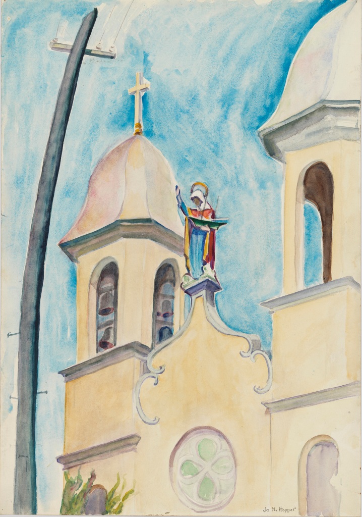
A few days ago I posted a review of the Hopper exhibit at the Cape Ann Museum in Gloucester, Mass., in which I described a painting by his wife, Jo N. Hopper, while admitting regret that I could not find it on-line.

Kind thanks to my friend, Tom Febonio of Rockport, a quaint fishing village right there at the tip of Cape Ann with Gloucester, who found it in a review of the exhibit by the Washington Post:

What fascinates here is the bend of the telephone pole toward the cross, as if drawn by a magnet, and the readiness of the Madonna’s outstretched hand to hold it up.

From a modern perspective, there may not be much more to say of it, but one century ago, Jo Hopper was looking at a brand new technology with an infrastructure that literally towered over the towers that congregations–that people–built to worship their God. When Europeans first settled in North America, most every village had a rule that nothing could be built anywhere nearly as high as a church steeple. Did Jo Hopper see an offer of collaboration or an imminent revolution? Was the hand raised in acceptance or resistance? And what of the identical T shape?

Since this is a much closer look at the church than was the painting I posted with the review, it’s worth noting the Spanish Revivalist architecture that we associate with the American Southwest and which, in this case, jolts many an unsuspecting New Englander visiting Gloucester for the first time.

Originally built in 1892 to serve a large Portuguese population that came to work in the local fisheries, it burned down in 1914, but was rebuilt by the 1920s when the Hoppers began spending summer vacations on Cape Ann.

The new church is nearly a replica of the Santa Maria Madalena church on one of the Azores islands from which most of the immigrants came. Our Lady of Good Voyage was added to the list of National Register of Historic Places in 1990.

-30-

Postscript: In addition to the fishing industry, many Azorean natives joined both the whaling and shipping industries, as Herman Melville tells us in a magazine piece from the 1850s titled “The ‘Gees” (with a hard G).  Following descriptions that are mostly laudatory–including an unsurpassable work-ethic–and at other times reflective of the prejudices of Melville’s day, the summary line is more characteristic of Ishmael, his open-to-all and dismissive-of-none narrator of that novel he penned at about the same time:

’Gees are occasionally to be encountered in our seaports, but more particularly in Nantucket and New Bedford. But these ’Gees are not the ’Gees of Fogo. That is, they are no longer green ’Gees. They are sophisticated ’Gees, and hence liable to be taken for naturalized citizens badly sunburnt. 

Painting by Alpini Gionatan of the volcano on one of the Azores, the main cause of emmigration.
https://www.inkroci.com/culture_movie/the-stories/classics/herman-melville.html

Hoppers on Cape Ann

When New Englanders say The Cape, it’s always understood to mean that imposing arm of a sandbar that flexes its bicep in the Atlantic and shakes a clenched fist at the Old World.

Those of us who live north of Boston are fine with that, as we play host to enough tourists who know of the beaches, the promontories, the lighthouses, the docks, the harbors, the woodlands, the trails, the fishing villages, the clam shacks, the orchards, the farmland, the castles, the theater troupes, the dance companies, the music ensembles of Massachusetts’ Other Cape that reaches from the coast like a hand open to all.

Cape Ann Pasture, Edward Hopper

While many artists have captured the beauty of Cape Cod on canvas, it’s hard to imagine that any have so thoroughly and repeatedly brought it to life as Edward Hopper (1882-1967) has done with Cape Ann.

May be hard to think of the creator of Nighthawks as a landscape (or seascape) painter, but the proof is on exhibit now through Oct.16 at the Cape Ann Museum in Gloucester, a thriving fishing port that Hopper and his wife, fellow painter, frequent model, and life-long muse, Jo Nivison Hopper, frequently visited in the Roaring 20s.

Any scape is equally misleading for an exhibit with so many paintings of buildings, featuring architecture as diverse as the dual towers of the Portuguese church and the mansard roof of the home of a wealthy merchant.

The Mansard Roof, Edward Hopper

But the overall impression is not so much of wood and bricks, boats and railroad cars, streets and water, or even trees and rock, harbor and surf.

All those subjects are on canvas, making the exhibit well worth the view.  But Edward Hopper & Cape Ann: Illuminating an American Landscape is most memorable for the lighting in which we see the buildings and boats.  Hopper was the artist, but Cape Ann is the star of the show.

House by ‘Squam River, Gloucester, Edward Hopper

Tempting to say the show was stolen by Jo N. Hopper as she signed her name to the ten or so canvases the filled a middle area surrounded by her husband’s work.  A telephone pole curving toward the church steeple strikes me as an essay I dare not write, although a few draughts of Fisherman’s Ale at Blackburn’s Tavern may change my mind.

Her husband’s portrait of her is memorable for the ingenious angle at which he took it, and her self-portrait well past middle-age fascinates us with an inevitable comparison to another of her as a teenager.  Called The Art Student, this was by Robert Henri who taught at the art school where Josephine Nivison and Edward Hopper met. According to the paragraph on the wall, she appears as “a little human question mark.”

But there’s no question over how either painter regarded Cape Ann.  Every canvas is a statement, an offer made by an open hand.

-30-

https://www.niceartgallery.com/Robert-Henri/The-Art-Student-Aka-Miss-Josephine-Nivison.html
No photos allowed at the Cape Ann Museum, and Jo N’s painting of Our Lady of Good Voyage with the telephone pole leaning toward it is nowhere to be found on-line. (If you can, please let me know,) Here’s one she did of the Portuguese church from another angle.
Prior to Cape Ann Museum, the only Hopper I had seen up close was Nighthawks at the Institute of Art in Chicago in 2008. Photo by Michael Boer: https://www.flickr.com/people/onewe/
A painting by British painter Phil Lockwood (born 1941) in which every window is Edward Hopper’s painting, even the bar-cafeteria is a Hopper.

Arm in Arm Alarm

Picture, if you will, a sword raised by an arm unattached to a body.

Now picture, directly below it, a man, standing alone.

Sounds like a video game—rated M for moronic—until you visualize the man as a Native American from colonial times, a bow in one hand and an arrow in the other. With that, it becomes history.

It is the Massachusetts state flag.

The text on the banner: Ense petit placidam sub libertate quietem (“By the sword we seek peace, but peace only under liberty”).

In recent years, petitions have aimed to ditch the flag for a new one.  Some want to simply ditch the armed, unmanned yet manly arm.

Does an arm all by itself have the right to bear arms?  Even if it’s in a sleeve?  Sorry if that’s barely a joke, but our state flag sure lends a whole new meaning to the term “arm in arm.”

And with a state name that sounds like a sneeze, it is decapitation waiting to happen.

Simply put, there’s no question that a sword raised over a flexed arm is poised to strike. On the flag, there is only one possible target, and he happens to be Native American.

Hence, opponents denounce the image as an expression of violence in service to white supremacy.

Defenders of the flag note that the sword is a replica of one wielded by Myles Standish, representing American victory in the Revolution.  They also claim that the arrow in the Wampanoag’s hand is pointed downward as a sign of peace.

Would they also approve the historical record of a new flag, among many proposed (albeit satirically), with an Indian arm wielding a tomahawk over a strolling Puritan carrying a Bible?

Put all politics aside, and regard this in terms of history, logic, and clarity.

Standish lived and died an Englishman, a military advisor for a colony, not for a state born 120 years after he died.

Also, while the Pilgrims just off the Mayflower made peace, the hard-driving Puritans soon followed.  After those peaceful—dare I say multiracial?—dinners in the 1620s, massacres topped the colonial menu in the 1630s.

That includes the Mystic Massacre in present-day Connecticut which wiped out an entire Pequot village, killing more than 700 men, women and children.

There’s a reason why the doomed ship in Moby-Dick is named “The Pequod.”

And, yes, it was a village, as many tribes had contrary to the contrived myth that has justified European theft of “unused” land.

The complaint of those who prefer myths–How will we know our history?–is always a defense of things that distort and hide our history.

True, tribes at times retaliated without discriminating between the innocent and the guilty, and some tribes collaborated with the English against other tribes.

But even that belies the claim of peace to justify the armed arm on the Bay State flag.

If a sword clearly poised to strike “stands for peace,” then maybe January 6 was “a normal tourist day.” Such was the history and logic that US Rep. Jamie Raskin (D-MD) had in mind when he quoted Voltaire during the second impeachment hearing:

Those who can make you believe absurdities, can make you commit atrocities.

In that case, history and logic are a lost cause, so let’s try clarity.

The primary function of a flag is that it be immediately understood from afar.  Sure, some details will need a closer look, but you get the big picture.

Last year, friends willingly exchanged their easily grasped six-colored rainbow flag for one with a five-colored triangle superimposed on the hoist side.

The result is an incoherent, eleven-colored eyesore, but try pointing that out and you’ll be called an enemy of diversity and inclusion no matter that you’re talking only about graphic design.

Those defending the Bay State flag are just as oblivious to confusion and graphic failure, reacting only to the intended content they favor.

For all that, there’s another, perhaps more compelling reason to change or replace it.

In early 1986, my daughter, still seven, saw a picture of Alaska’s eight-star flag and came to me:  “Dad, let’s go to as close to the Big Dipper and North Star as we can get.”

Picture, if you will, a seven-year-old looking at the menacing confusion of an armed, bodyless arm that appears to be reaching out of a grave poised to slash downward at the head of any person of any description.

Now, can you picture the child wanting to go there?

-30-

While preparing this, my friend Kurt Kaletka of Watertown informs me that Utah just adopted a new flag that will become official next year. Apparently there was no political controversy over any content. It was purely a matter of having a more modern, dynamic, visually pleasing design that is immediately recognizable at a distance:

Very similar in style to my favorite of the few dozen proposals for a new Massachusetts flag, designed by one E. Cashman. Yes, that’s a mayflower floating on a sea of blue between fields of green and cranberry bogs:

Kurt also tells me that the original seal for Massachusetts “featured a Wampanoag with a speech bubble coming out of his mouth begging, ‘Come over and help us’”:

He found it in a Culture Quarks, a blog by Rodney Aist who describes the distinct relationships of the Pilgrims and Puritans with the native tribes. I highly recommend it, link below, for anyone wanting to know Massachusetts’ colonial history. In one paragraph in particular, Aist could be writing not just of settlement in New England, but of Manifest Destiny across the continent:

The seal beckons the Christian to mission and evangelism — in reality, to actions too often expressed in events such as the Mystic Massacre. Of course, the Indians weren’t looking for help, nor did they receive any. The seal was simply a self-interested invitation to come and ‘help yourself’ and an officially smug reminder to the Puritans that God was on their side.

History Sewn & Sown

Those of you outside Massachusetts may not have heard this, and I’ll bet that many of you inside may not have heard it either, but our state flag is under attack.

I’ll let the image speak for itself and welcome anyone to decide if the critics are right that it appears to be an imminent act of violence against a Native American. Or if the raised sword is a patriotic reminder of the American revolution while the arrow pointing to the ground is a symbol of the Pilgrims making peace with the Wampanoag tribe.

Is the juxtaposition purely coincidental?

Before long I’ll let you know what I think, but for now I offer a column I had in the Newburyport Daily News 35 years ago next month on the subject of state flags, prompted by my daughter, then about to turn ten, telling me that a picture of Alaska’s seven-star flag made her want to visit the state.

Of the Bay State flag, I said nothing of the offense, real or imagined, nor did I remark on the Confederate imagery on three flags of Southern states, but I still think my reason for disarming the flag–or disposing of it entirely–is more compelling than the case being made today.

Since this was written in 1988, the last lines were a comparison of the flag to the presidential campaign of Massachusetts Governor Michael Dukakis. I have replaced those lines with something relevant today:

State flags: history that is sewn

When they were designed and first raised, they represented all the things most important to those who lived under them. Yet today, they are barely recognized–or noticed for that matter.

How many readers of this paper, for instance, can describe the figure inside the blue shield on the Massachusetts flag, or what raises what above that shield?

Of the original 13 states, only the Carolinas do not feature coats of arms or state seals, unless the palmetto tree is South Carolina’s seal.

Maryland may claim our most unusual flag. Founded by two families who wanted their rectangular coats intact, Maryland quartered, rather than halved, its flag. Each coat tyhus gained cross-corners–one an elaboratre play of black and yellow, the other a stately arrangement of red and white. The result is something you’d expect to find flying over a ski-lodge in Liechtenstien.

Few flags feature anything other than red, white, or blue as a prominent color, although three are set on attactive light shades of blue. Delaware has “colonial blue,” while South Dakota and Oklahoma have fields of “azure blue.”

Geographically relevant flags of Arizona and New Mexico feature the yellow and gold of southwest deserts. Arizona flames with sunset or sunrise, while New Mexico tenders the subtle and sparse Zia Pueblo design of the sun.

Surprisingly, there is only one green flag out of fifty. More surprisingly, it does not fly over Vermont, a name that means “Green Mountain.” Not surprisingly, it belongs to the “Evergreen State” and features a portrait of its namesake, George Washington, in its centered seal.

Washington’s eccentric neighbor has the only two-sided flag, a dark blue field with the Oregon seal on one side and a golden beaver on the other–a welcome reminder that, before the buffalo (found on Wyoming’s flag), the beaver was the most lucrative New World prize in the eyes of European fashionistas.

Only nine flags lack anything resembling an emblem in their center, although Nevada puts its “Battle Born” insignia in the upper left. And state names appear on thirty flags, including South Dakota and Idaho which name themselves twice–once on the seal and again across the bottom.

While Idaho and Maine compete for best potatoes, their flags compete for best motto. Other states carry phrases with predicable words including “liberty,” “equality,” “union,” “rights,” and in the single word under Rhode Island’s anchor, “hope.” Give me Maine’s Dirigo (“I direct”), or give me Idaho’s Esto Perpetua (“Live Forever”).

Four flags carry the slogans of our currency: Michigan, Wisconsin, and North Dakota with E pluribus unum; Florida with “In God We Trust” on St. Andrew’s crimsom cross it shares with Alabama.

Kentucky and Missouri share the historic line that became an theme song on campuses in the Sixties: “United We Stand, Divided We Fall.” In a similar spirit, New York’s colorfully meticulous shield is underscored by a single word: Excelsior (“onward and upward”).

Hawai’i’s flag is the only one to incorporate the Union Jack; only those of Georgia, Mississippi, and Arkansas have Confederate themes, although Tennessee’s three white stars in a blue circle on a red field hint at it. In fact, those stars represent the three distinct topographical divisions in that most underrated, scenically elegant land.

Ohio has the only non-rectangular flag. A swallow-tailed “burghee,” its red-white-and-blue stars-and-stripe design makes it unmistakably American nonetheless.

For a detailed description of the geography, people, animals, tools, bridges, buildings, flora and fauna shown on each, check Your State Flag in the reference room of most libraries. The book contains full-page color photos of all fifty, as do other reference books and atlases.

Daughter Rachel piqued my interest two years back when she read about Alaska’s seven-star flag in National Geographic’s World and talked me into a trip to “as close as we can get to the Big Dipper and the North Star.”

That and the lumbering bear of the “California Republic” may be her favorites, though I might pick Louisiana’s mother pelican with wings spread over three chicks looking up to her. Warm and earnest, their faces have a cartoon quality that is alive and upbeat–a true travellers’ flag.

What’s the worst flag? Well, Arkansas’ diamond design looks like a label for something that will never be sold over a counter. But there’s only one foolisly incongrous flag:

An Indian on a European shield beneath a disembodied arm weilding a sword? Can anyone imagine a child looking at that and saying, “Hey, Dad! Let’s go here!”

I didn’t think so.

-30-

The text on the banner: Ense petit placidam sub libertate quietem (“By the sword we seek peace, but peace only under liberty”).

Most people looking for a change want nothing more than the removal of the arm and sword. Type massachusetts state flag proposals redesign into a search engine for about two dozen proposed new flags, many of them quite attractive and acceptable to most everyone asking for change. My pick:

From designer E. Cashman:

The flower is a mayflower, which is the state flower and also the name of the vessel which carried the original Pilgrims over to Plymouth, MA. It represents the courage of the civilians of Massachusetts and honors the people who helped start the foundations of America. The cranberry red, blue and green are the State colors: Green represents the rolling hills and lush forest life, blue represents the ocean, and red represents the cranberry, which is the state berry and the state drink. The flower also has six petals to represent the fact that Massachusetts was the sixth state to ratify the US Constitution. The only reason I added the dividing lines was because each color is pretty dark, so the white fimbriation lines add contrast and make the flag more attractive to the eye.

Well, it does make a point now, doesn’t it?

https://zebratigerfish.blogspot.com/2017/11/happy-thanksgiving-newcomer.html?m=1

All at once. Some of the colors are off. South Dakota is a much lighter shade of blue, Vermont darker, and Delaware blue not green.